

Businesses generate massive amounts of data from sales, marketing, finance, customer interactions, operations, and other business processes. However, collecting data is only the first step. The real challenge is understanding that information and turning it into actionable insights.
This is where data visualization becomes essential.
If you are wondering how to visualize complex business data, the key is to transform large and complicated datasets into simple, meaningful visual representations such as charts, graphs, dashboards, and interactive reports. Effective visualization helps business teams identify trends, understand relationships, detect problems, and make data-driven decisions faster.
What Is Complex Business Data?
Complex business data refers to information that contains multiple variables, sources, relationships, or dimensions that can make analysis difficult.
For example, a company may need to analyze:
- Sales across multiple regions and products
- Customer behavior across different channels
- Marketing campaign performance
- Revenue and profitability trends
- Supply chain and inventory data
- Employee and operational performance
- Customer retention and churn
- Financial forecasts and budgets
Looking at thousands of rows in a spreadsheet may make it difficult to identify meaningful patterns. Data visualization provides a structured way to turn this information into insights.
Why Is Data Visualization Important for Business?
Data visualization makes complex information easier to understand. Instead of examining raw numbers, decision-makers can use visual elements to quickly identify patterns and trends.
Some key benefits include:
Faster Data Analysis
Visual dashboards allow users to identify important changes without manually reviewing large datasets.
For example, a sales dashboard can immediately highlight which products are generating the highest revenue and which regions are underperforming.
Better Decision-Making
When business data is presented clearly, executives and managers can compare performance, identify opportunities, and make decisions based on evidence rather than assumptions.
Easier Identification of Trends
Charts and graphs can reveal patterns that may not be obvious in raw datasets. A line chart, for example, can show how revenue changes over time.
Improved Communication
Complex analysis can be difficult to explain using spreadsheets or lengthy reports. Visualizations make business insights easier to communicate across technical and non-technical teams.
How to Visualize Complex Business Data
Knowing how to visualize complex business data requires more than simply creating charts. The visualization should match the type of information you want to communicate.
Here is a practical process to follow.
1. Define the Business Question
Start by identifying what you want the data to answer.
Instead of asking:
Ask:
“What can we show with this data?”
“What business decision should this data help us make?”
For example:
- Which products are driving revenue?
- Why are customers leaving?
- Which marketing channels generate the highest return?
- Which regions are experiencing declining sales?
- How has profitability changed over time?
A clear business question helps determine what data and visualization you need.
2. Collect and Prepare the Data
Complex business data often comes from multiple systems, including CRM platforms, ERP systems, databases, spreadsheets, websites, and cloud applications.
Before visualization, the data should be:
- Cleaned
- Standardized
- Validated
- Deduplicated
- Properly structured
- Integrated from relevant sources
Poor-quality data can lead to misleading visualizations, even when the dashboard itself looks professional.
3. Identify Relationships and Patterns
Before selecting a chart, examine how different variables relate to one another.
For example, you may want to understand the relationship between:
- Marketing spend and revenue
- Price and sales volume
- Customer age and product preferences
- Region and profitability
- Inventory levels and demand
Understanding these relationships helps you choose an appropriate visualization.
4. Choose the Right Visualization
One of the most important principles when learning how to visualize complex business data is choosing the right visual format.
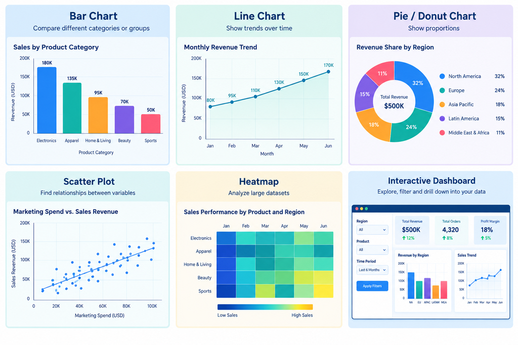
Bar Charts
Use bar charts when you need to compare different categories.
For example, a company could compare revenue across product categories.
Line Charts
Line charts are useful for showing trends over time.
They can be used to visualize:
- Monthly revenue
- Customer growth
- Website traffic
- Sales performance
- Operating costs
Pie or Donut Charts
These can be useful for showing simple proportions, but they should generally be limited to a small number of categories.
For example, a company could visualize revenue contribution by business segment.
Scatter Plots
Scatter plots can help identify relationships between two numerical variables.
For example, businesses can analyze whether higher advertising spending is associated with increased sales.
Heatmaps
Heatmaps can be useful when analyzing large amounts of categorical or time-based information.
For example, a retail company could use a heatmap to identify sales performance by product and region.
Interactive Dashboards
When business data contains multiple dimensions, interactive dashboards can combine several visualization types into a single analytical experience.
Users can filter data by region, product, department, customer segment, or time period.
5. Simplify the Visualization
One common mistake is trying to display everything on one dashboard.
More data does not necessarily create more insight.
An effective business dashboard should focus on the metrics that matter most to the intended audience.
For example, an executive dashboard might focus on:
- Revenue
- Profit margin
- Customer growth
- Customer retention
- Sales pipeline
A marketing dashboard may instead focus on:
- Leads
- Conversion rate
- Cost per acquisition
- Campaign performance
- Marketing ROI
The visualization should provide enough context to support decisions without overwhelming the user.
6. Add Context to Business Data
Numbers without context can be difficult to interpret.
For example, a dashboard showing “$5 million in revenue” does not necessarily tell you whether performance is good or bad.
Adding comparisons can make the information more meaningful:
- Current revenue vs. previous period
- Actual revenue vs. target
- Current sales vs. previous year
- Regional performance vs. company average
This allows users to understand not just what happened, but also how performance changed.
7. Use Interactive Data Visualization
Interactive visualization can make complex business data easier to explore.
Instead of creating separate reports for every business segment, an interactive dashboard can allow users to filter information dynamically.
For example:
Company → Region → Country → Product → Month
A user can start with overall revenue and drill down into a specific region, product, or time period.
This approach is particularly useful when organizations have large and continuously changing datasets.
Common Mistakes When Visualizing Complex Business Data
Even well-prepared data can become difficult to understand if the visualization is poorly designed.
Using Too Many Charts
A dashboard containing dozens of charts can overwhelm users. Focus on the visualizations that answer important business questions.
Selecting the Wrong Chart Type
A visualization should match the analytical purpose. For example, using a pie chart to show a long-term trend is generally less effective than using a line chart.
Ignoring Data Quality
Incorrect, duplicated, or incomplete data can result in misleading business insights.
Using Too Many Colors
Colors should communicate meaning rather than simply make a dashboard look attractive. Use them consistently to highlight important information.
Failing to Define the Audience
An analyst may need detailed operational metrics, while an executive may only need high-level business KPIs.
The same dataset may therefore require different visualizations for different audiences.
How AI and Modern Analytics Platforms Improve Data Visualization
Modern analytics platforms increasingly combine data integration, analytics, artificial intelligence, and visualization capabilities.
AI can assist with tasks such as identifying patterns, generating insights, detecting anomalies, and helping users interact with business data using natural language.
For organizations dealing with complex data environments, modern platforms can also connect information from multiple sources and provide a unified environment for analysis.
This makes it easier for business users to move from raw data to dashboards and actionable insights.
Best Practices for Visualizing Complex Business Data
Keep these principles in mind when creating business visualizations:
- Start with a clear business question.
- Use reliable and properly prepared data.
- Select visualizations based on the analytical objective.
- Keep dashboards focused and easy to navigate.
- Use consistent labels, units, and terminology.
- Provide comparisons and relevant context.
- Allow users to filter or drill down when necessary.
- Avoid unnecessary visual elements.
- Design dashboards for the intended audience.
- Review visualizations regularly as business requirements change.
Final Thoughts
Learning how to visualize complex business data is not simply about creating attractive charts. Effective data visualization is about turning complicated information into a format that people can understand and use.
The process starts with a clear business question, continues with reliable and well-structured data, and ends with visualizations that communicate meaningful insights.
Whether you are analyzing sales, finance, marketing, customer behavior, or operations, the right visualization can help teams discover trends, understand performance, and make more informed business decisions.
FAQs
To visualize complex business data, start by defining the business question you want to answer. Then clean and organize the relevant data, identify relationships and patterns, and select an appropriate visualization such as a bar chart, line chart, scatter plot, heatmap, or interactive dashboard. Keep the final visualization focused on the insights that matter most to your audience.
The best way to visualize complex data depends on what you want to communicate. Bar charts work well for comparing categories, line charts show trends over time, scatter plots reveal relationships between variables, heatmaps help analyze large datasets, and interactive dashboards allow users to explore multiple dimensions of business data.
Common charts used for business data visualization include bar charts, line charts, pie and donut charts, scatter plots, heatmaps, area charts, and interactive dashboards. The appropriate chart should be selected based on the type of data and the business question being analyzed.